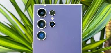
Samsung continues to refine its One UI experience, rolling out updates aimed at improving user interaction and aesthetics. The recent 6.1.1 update brought several new features and enhancements to the user interface. Typically, Samsung announces its next system update following Google’s I/O event, with the stable build arriving by the year’s end. However, due to the integration of AI features, the release of Android 15 and One UI 7 has been delayed. Currently, a prototype showcasing the S25 Ultra design with One UI 7 has surfaced, hinting at some design elements inspired by Apple.
A Fresh Look at Galaxy S25 Ultra’s One UI 7 Mockup
A recent mockup highlights the Galaxy S25 Ultra’s refreshed look, featuring One UI 7. Samsung seems to be taking a bold step forward by integrating new design and feature elements into the upcoming Galaxy S25 series. Shared by Ice Universe on X, the mockup illustrates Samsung’s premium model, the Galaxy S25 Ultra, which will run on Android 15 and present a revamped control center reminiscent of the iPhone’s design.
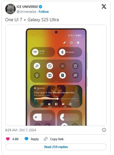
The S25 Ultra’s design appears to move in a new direction, as the sharp corners seen in previous models are being replaced by more rounded edges. This change offers the series a sleeker, more sophisticated appearance. Samsung has retained the flat display format, consistent with its predecessor, maintaining continuity in its flagship line.
New UI Direction for a Streamlined Experience
Samsung is shifting towards an iPhone-inspired design approach with the updated UI and redesigned control center. This update introduces a separate notification panel, providing a cleaner and more streamlined look, especially with the consistent widget sizes. The Wi-Fi and Bluetooth toggles now have their own tiles, and the quick settings panel has been expanded to accommodate up to sixteen toggles, offering greater customization and flexibility.
Other significant updates include a revamped camera app, which has been repositioned to the bottom of the screen for easier one-handed access. The battery indicator is also integrated within the overall minimalistic theme. The home screen, much like the iPhone’s, follows a clutter-free design, while the settings app is optimized for more intuitive navigation. This latest mockup demonstrates Samsung’s commitment to a visually refined interface in One UI 7, enhancing the overall user experience.



By Andrej Kovacevic
Updated on 9th March 2025